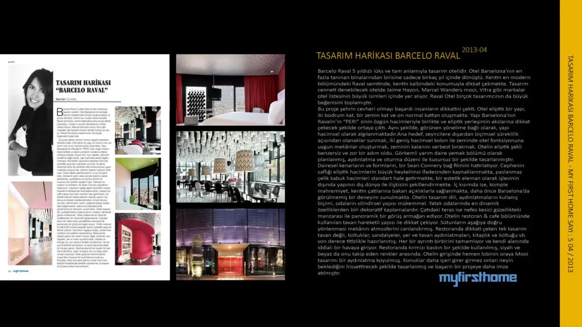
The Barcelo Raval is a 5-star luxury and truly design hotel. The hotel has transformed into one of Barcelona’s most recognizable buildings in just a few years. It attracts attention with its location in the heart of the city, in the raval district in the most modern part of the city. Brands such as Jaime Hayon, Macel Wanders mooi and Vitra are among the big names in the hotel list in 7 hotels that can be called design paradise. Raval Hotel has also received great appreciation from many designers.
This project managed to become the gem of the city and attracted people’s attention. The hotel is an elliptical structure, consisting of two basement floors, a ground floor and ten regular floors. The structure emerged in a way that draws attention to the axes of the elliptical layout, together with the original volumes of Barcelona’s “PERI” in Ravalin. Likewise, depending on the apparent orientation, the building is perceived as volumetric. The main goal is to provide the audience with opportunities in terms of formal continuity from the outside, and to create spaces suitable for the hotel function on the ground with two large volumetric columns. The elliptical shape of the hotel was a unique and difficult step. It was planned as a majestic semi-circular dining area and was perfectly designed with lighting and seating arrangement. Your circular edges and forms remind me of a Sean Connery bond movie. The purity of the façade stems from the large sculptural expression of the elliptical volumes, the stainless steel shell standardizes the volumes, and shapes the relationship of the building with the outside world, apart from its function as an aesthetic element. Inside, complete privacy is ensured by openings overlooking the city’s rooftops, offering an experience never before seen in Barcelona. The design language of the hotel, the way the lighting is used, the cylindrical structure of the rooms are perfect. One of the most dynamic features in bedrooms is decorative coverings.
The roof terrace offers a panoramic view with its breathtaking view. The ceiling used in the restaurant & cafe section of the hotel draws attention with its movable structure. The downward orientation of the columns enlivens the atmosphere of the place. The ceiling is not the only design that draws attention in the restaurant, but also armchairs, chairs, floor and ceiling lighting, bookcase and armchair etc. crafted with the utmost care. Each detail complements each other and takes on an assertive mood in its own field. Red is used predominantly in the restaurant, followed by black and white. At the entrance of the hotel, a Mooi design lighting is placed right next to the lobby. Another successful project has been designed to make guests feel what awaits them as soon as they enter.
